Friday, September 16, 2011

AP Photography: Week 4(ish)

Hey guys! Sorry I've kinda been slacking on keeping my posts up to date. :( BUT these are my week 4 pictures (Shape) and I'll be posting week 5 by next Tuesday. So tell me what you think, what you like and don't like, and like always, ENJOY!

My favorite by far! For many reason but the main one is the lighting reacting with the texture. As you can probably tell, I went pretty crazy with the sepia and it really brought attention to the really awesome texture of the statue. I also like the way the horizontal and vertical shapes intercept each other.


This picture isn't that interesting but I really like the contrast going here. The contrast in the darks and lights and then the contrast in the plain shapes in the foreground and the more complex shapes near the top.

The thing that really catches my eye about this one is the way the colors of the background and the main object of focus interact. The main thing I was going for with this picture was the shape of the sticks working with the binding.
There's so much going on in this picture! The wasps are really great because they are able to provide both vibrant colors and complex shape to the picture. The one big negative thing I have to say about this picture is the distracting background.
\Colors, shapes, line, and texture. This picture really draws my attention because it has all of things and really grasps them well. The color of the marbles is the best.
It's simple yet complex at the same time. This particular plant is great to photograph because it has AMAZING natural shape. The one thing really pulls away from this picture is that it is a little bit blurry.
This one is full of shapes, from the pointy mechanism in the back to the roundness of the can. My favorite thing about this is the contrast of the shiny smooth silver can with the brown gunky stuff on the opener.
As far as following the actual assignment goes, this is my favorite. It has the most complex and contrasting shapes.
Ehhhh, this one is definitely not that interesting but I really like the vibrant colors and the shape of the tiny diamonds inside the reflector.
This is one of those pictures that looks SOOOO much better without color. In this particular picture, the lack of color just gives it a more simple and less distracting look.
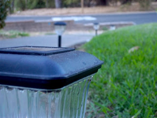
This one is my least favorite for the week but it has good shape in the bottle cap and a nice, simple, and blurry background.

For this one, I really like the the goldish hue and the dark lines in the background.

Thursday, September 1, 2011

AP Photography: Week 3

Hey! I'm now into my third week of AP Photography and I actually had a lot of fun with this assignment (line)! These are my top twelve so tell me what you think!


Tuesday, August 30, 2011

AP Photography: Week 1 & 2

Hey everyone! I've decided to add a photography portion to my blog as I go through my AP Photography course. The first six are from Week 1 and there wasn't really an assignment it was just to see what we already knew. The next 11 (Week 2) are all about animals; these aren't my favorite so far being that animals are hard to photograph. ANYWAY, comment and tell me you think, all critiques are welcome!